Well, we made it to Lent, earlier this year than in years past it seems. And like most things church year related, it snuck up on me. Since I’ve been at Westfield, we’ve hung giant swaths of fabric across the sanctuary, effectively cutting it in half. It makes the usually huge, airy room feel small and dark and uncomfortable. It created a physical reaction, mostly because it physically changed the shape and the size of the room.
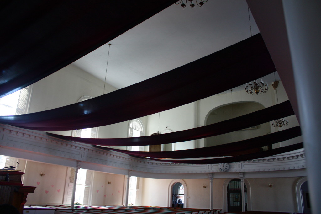
Then when Easter finally arrives, there’s always such relief to have the room and light and space back.
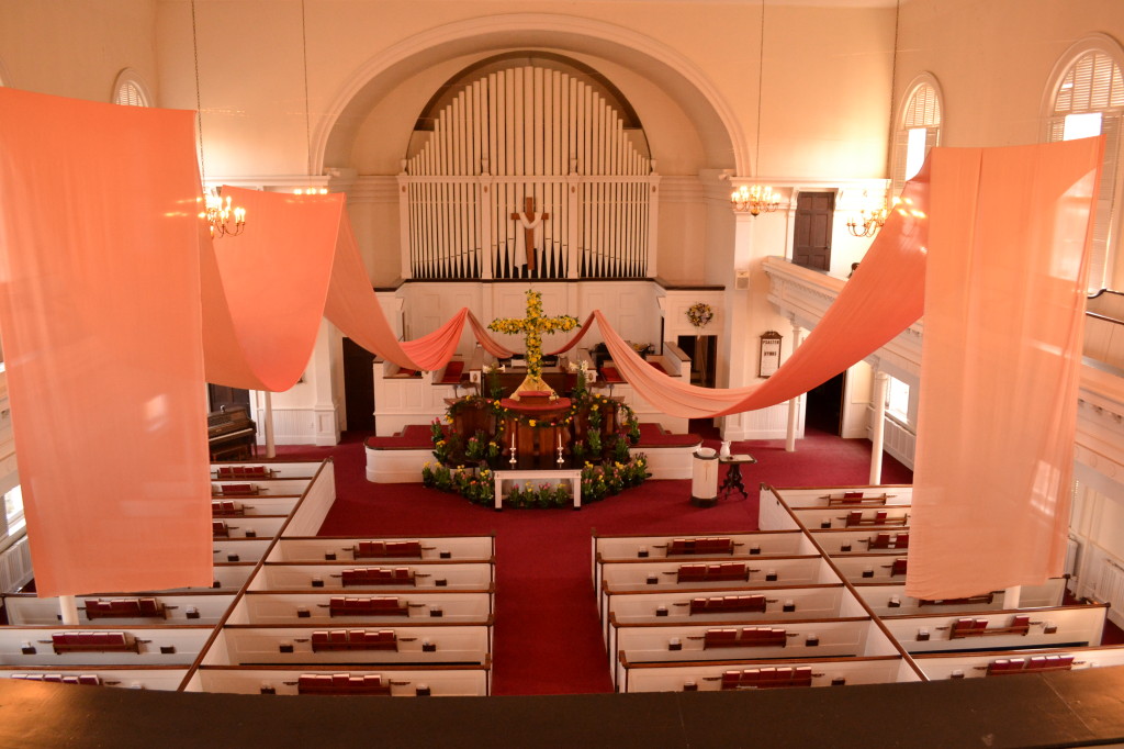
This year though, after 3 years of purple fabric, it was time to try something new (I’ve a hunch the peach fabric might be back–it’s just so majestic, isn’t it?).
An Advent or two ago, my colleague and friend, the Rev. Jeanne Murawski of Immanuel UCC, posted a picture on Facebook of her church in Illinois. They’ve got a similar balcony to Westfield’s, and for the season of Advent, they hung big letters that spelled out the themes of the each week of the season: Hope, Peace, Joy, Love.

Side note: Don’t you just love that pulpit? You better believe I’d preach from that!
My intent was to do something like that for our Lenten themes this year. Except, there’s one big difference between Jeanne’s church and mine. Westfield’s sanctuary is HUGE. So, letters as big as an 8.5″ x 11″ sheet of card stock, just wouldn’t do because they’d get lost. Not to mention, we need them to hang for six weeks during a season that goes from wet and cold to dry and cold to everything in between.
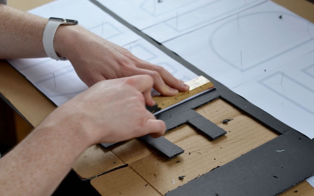
Those were our main challenges: size and structure. The answer? Foam board. Luckily, it was on sale at the local office supply store. I bought ten sheets, and we began our adventure in words the afternoon before Ash Wednesday.
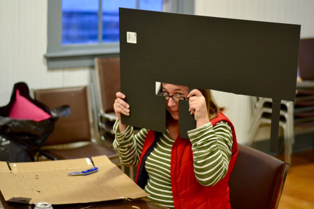
Now, before we go any further, I just have to gush for a second about my administrator, Carrie. My admins have always been troopers. The last permanent one melted 3000 plastic cups with me. Remember that? Carrie’s no different. Carrie is awesome for a thousand and three reasons (like her cake company among many, many others), but two of the top ten reasons she’s so great is that she (1) is super crafty and (2) is willing to put up with my visual-worshippy whims. Back to the project at hand.
I made it back to the office with ten sheets of foam board, a box cutter, a box of pins, and hot glue gun. Carrie knew I was up to something, but I could tell she was a little suspicious. We set up the tables and began.
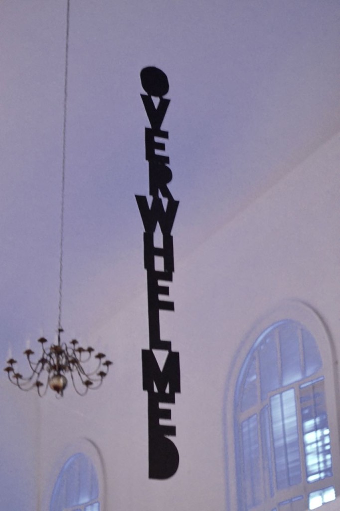
Earlier in January, I had gone through the lectionary readings for Lent and decided on one word themes for each week. I settled on: tempted, intimidated, impatient, lost, wasted, overwhelmed. Cheery, right? Well, it is Lent. Onward.
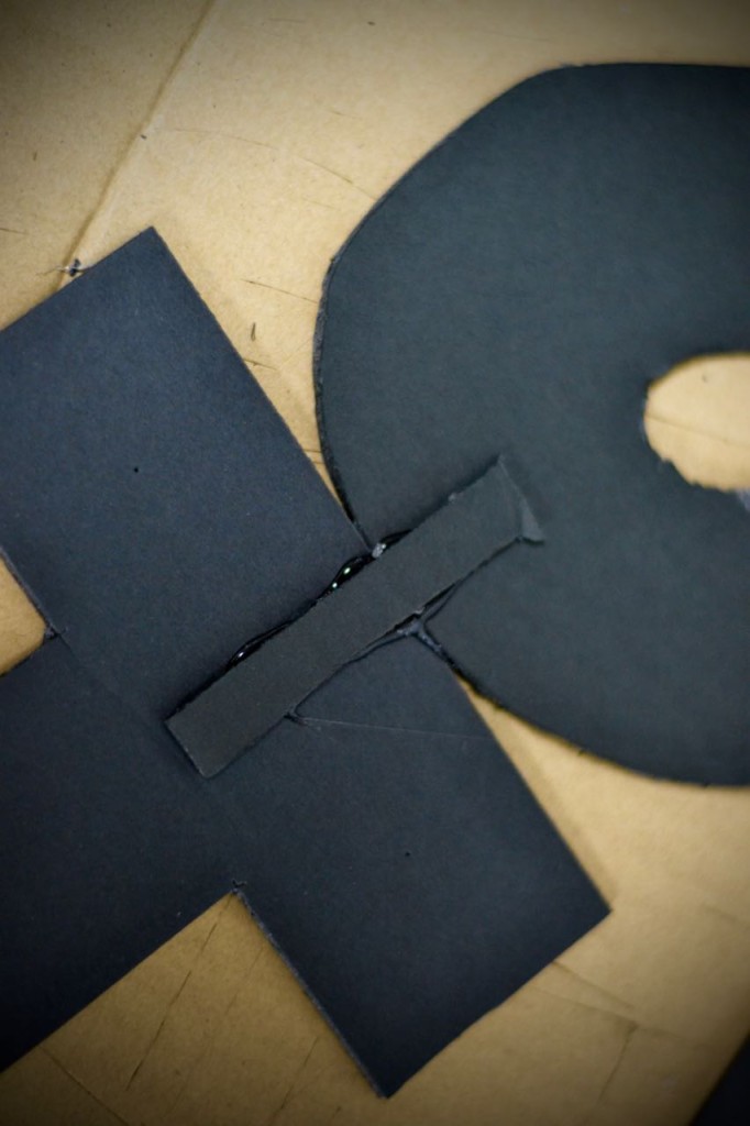
I printed off each letter (47 letters in total–all fit on 8.5″x11″ paper except for those pesky “w”s. They were printed on 8.5″ x 14”). Then we (and by we, I mean Carrie) pinned them onto the foam board. Pro tip: We chose a font that didn’t have the inside of rounded letters cut out. It made our lives WAY easier.

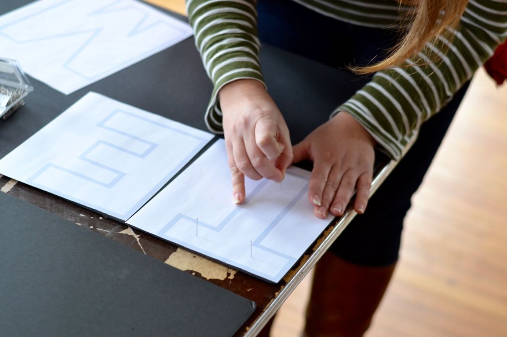

Once we had the board covered in letters, the cutting began. We quickly learned that scoring the board first, then going back a second time to cut all the way through made quicker, tidier work of it all.
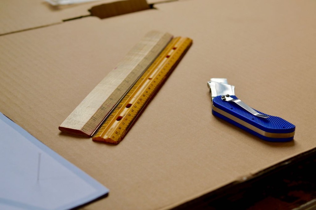

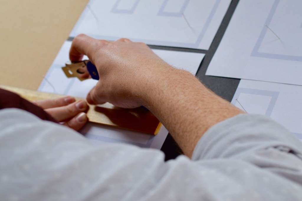


See that ruler there? Confession: we dropped that REAL quick. Eyeing it worked just as well–particularly when I stopped trying to cut all the way through the board on the first pass. As the letters were cut, we lined them up on any surface we could find.

Then it was time to pull out the hot glue gun. My friend Jeanne hung her words horizontally. But remember, the space between the sides of our balcony is much wider. Our solution? Stack the words vertically.
I carefully put glue on the edges that touched, then added connecting supports between every letter.
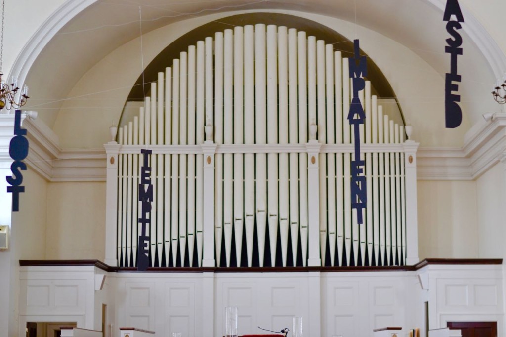
The longest word ended up being over seven feet long, which is fine since we’re working with a two and a half story room. And since they were made of foam board even the long words barely weighed anything.
You might recall that we have fishing line strung across the balconies, from railing to railing and from window to window. This provided us with lots of options as to where the words would be hung and from what height. Obviously, the longer words are hung from higher lines. You might wonder how we attached the word to the line. The answer? Binding clips.

The binding clips worked out swell because we could move them along the top of the word depending on the weight of the word and how it hung. If a word was crooked, we’d move the clip to the left or right as needed.
Next, you’ll need some willing, patient, and dedicated (and wonderful!) volunteers. John and Suzon were just what we needed! They came in on Ash Wednesday and got to work. Thank goodness for them and people like them!

Each word was attached to the line with two extra lines attached to the binder clip. Those extra lines allow us to adjust the word’s location over the pews–we can easily run them further out or bring them back. This also allows us the ability to pull the words down easily when we have a funeral or wedding. You would’t want “impatient” hanging over a coffin or “overwhelmed” over the wedding party, would you?

Finally, I set up an altarscape for our ecumenical Ash Wednesday service. The clergy had decided that we’d share communion at this service is the tradition of the host congregation. So, I needed room for the elements and for the ashes. Here’s what I came up with:

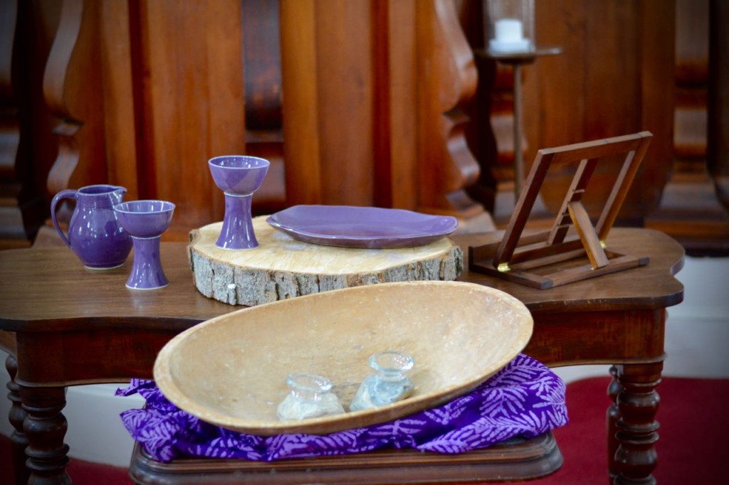
The bread board with the pyxes (containers for ashes) was my grandmother’s. The slice of wood comes from an ancient tree we had to cut down on the church property last year. It had been there since before the current building was erected. It’s a reminder of where we’ve come from. The communion set was the wedding set Greg and I had made for Westfield on the occasion of our wedding as our gift to the church.
All of it came together in a really striking way:


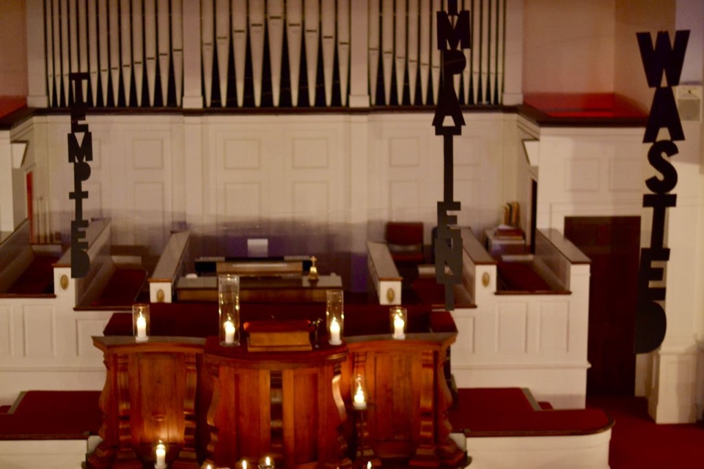
The effect on Ash Wednesday was reflective bordering on haunting–which I’m not really opposed to. The next Sunday, it was fascinating to watch worshippers come in and look up, figuring out just what was above them. They might not quite get it yet, but they’re engaged in a way they wouldn’t be otherwise.
And that’s the point of visual worship, isn’t it? People don’t have to love it. They can even hate it. But the fact they’re engaging it at all serves to deepen their faith life in some way.
What’s next? Well, I can’t tell you that. Yet. But suffice it to say, our Lenten words won’t be here forever–and will soon be replaced with some much, much more celebratory.
How are you marking the season of Lent in your church?


Trackbacks/Pingbacks